Rebellis.ai
2024
AI Recommendation System
Designing an AI Recommendation System to Improve Prompt Quality

Overview
Research showed that many users struggled to write prompts the model could interpret: short, vague inputs consistently produced disappointing animations, not because the model was weak, but because the prompt field gave people no support.
Rebellis AI lets users generate 3D character animations from text prompts, in a product like this, the prompt is the interface.
I designed and prototyped an AI-powered prompt recommendation system, working from user flows and
in Figma through to a tested, shipped interaction pattern that guided users toward richer, more structured prompts.

Problem
Why the simple Prompt Wasn't Working
In a generative AI product, the prompt is the only lever users have to tell the model what they want.
Looking closer, through Microsoft Clarity session recordings, Discord conversations, community feedback, live workshops, and a direct read-through of real prompts, the actual issue came into focus: People simply didn't know how to write a prompt it could work with. This surfaced three challenges:
Friction in prompt quality. Users routinely typed inputs as sparse as "walking," with no style, pace, or emotional detail, and had no way to know what a stronger prompt looked like before hitting generate.
A missed teaching opportunity. The prompt field was the single most-used surface in the product, yet it offered no examples, defaults, or contextual hints, every user was expected to already know prompt engineering.
No scalable pattern. We needed one system that worked equally well for a one-word prompt and a ten-word prompt, without leaning on a one-time onboarding tutorial that most people skip or forget.
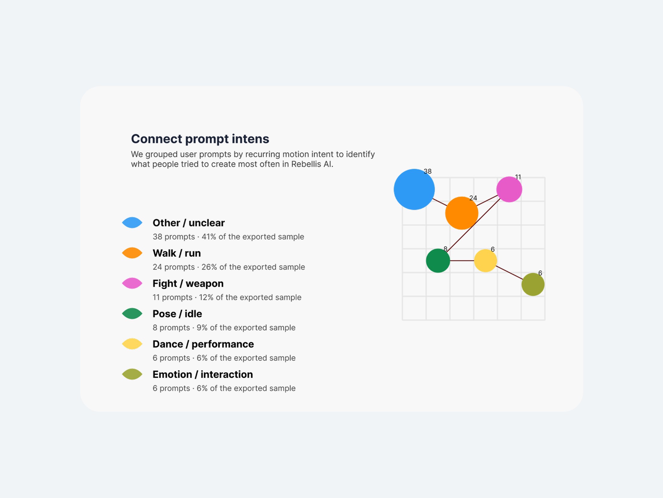
I also grouped prompts by intent to see what people were actually trying to create: walk/run motions were the largest identifiable category (26%), followed by fight/weapon (12%), pose/idle (9%), dance/performance (6%), and emotion/interaction (6%). The single biggest group , 41% of the sample, was too vague to categorize at all, which was the clearest signal that this was an input-design problem across every use case, not a niche one.
Research
Prompt analysis and pattern discovery
To get past anecdotes, I combined behavioral and qualitative research , Clarity recordings, Discord threads, workshops, support conversations ,with a direct audit of real usage: a sample of 93 user-submitted prompts, reviewed line by line.
15% (14 of 93) contained only 1–2 words, providing almost no context for the model.
33% (31 of 93) included some descriptive details, but key animation information, such as motion, timing, or context, was still missing.
52% (48 of 93) were six words or longer, yet remained ineffective because they described the request vaguely rather than clearly.
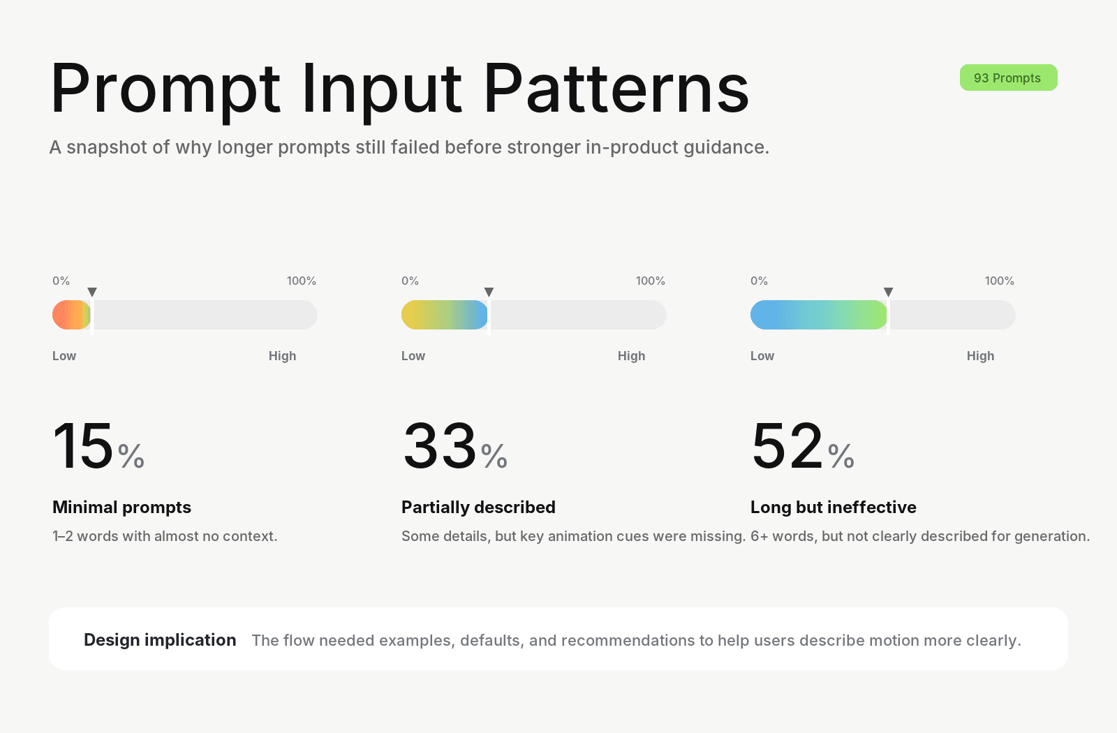
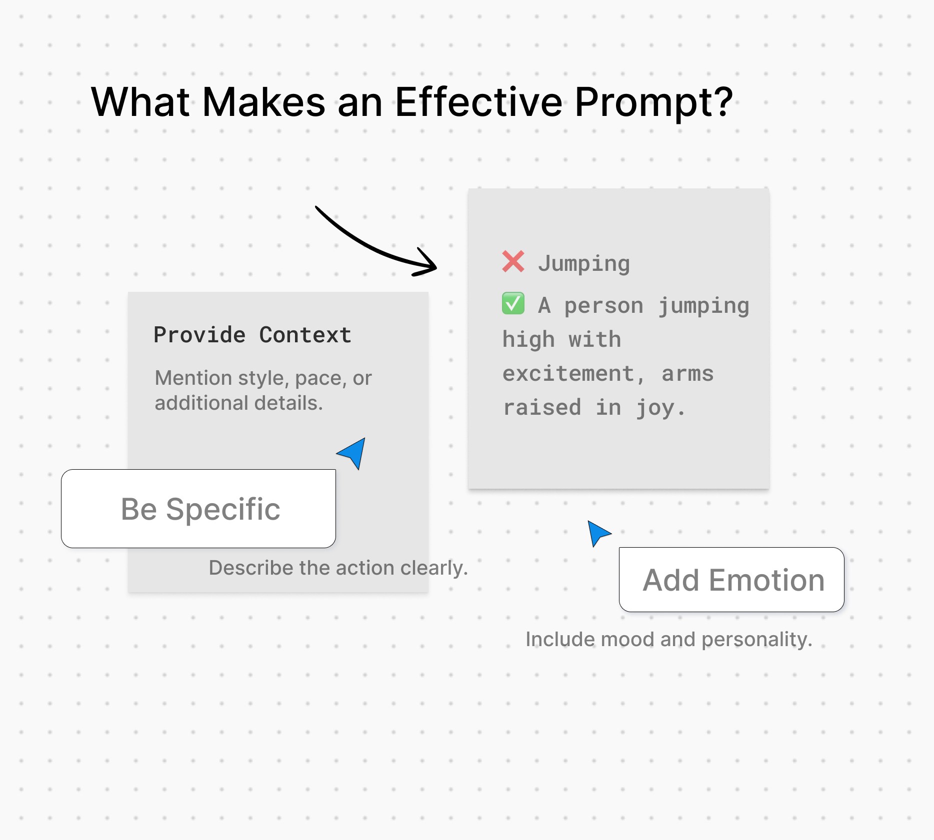
This revealed that the issue wasn't simply prompt length. Users needed guidance on what information to include, not just encouragement to write more.
Ideation
Designing the Recommendation System
Working within Rebellis's existing UI patterns, I mapped the new interaction as a user flow first.
where recommendations appear, when validation triggers, how a user accepts, edits, or dismisses a suggestion, then moved into wireframes and, once the flow held up, high-fidelity interaction design in Figma. The goal throughout was to make good prompting the path of least resistance for every user, not an extra step reserved for onboarding.
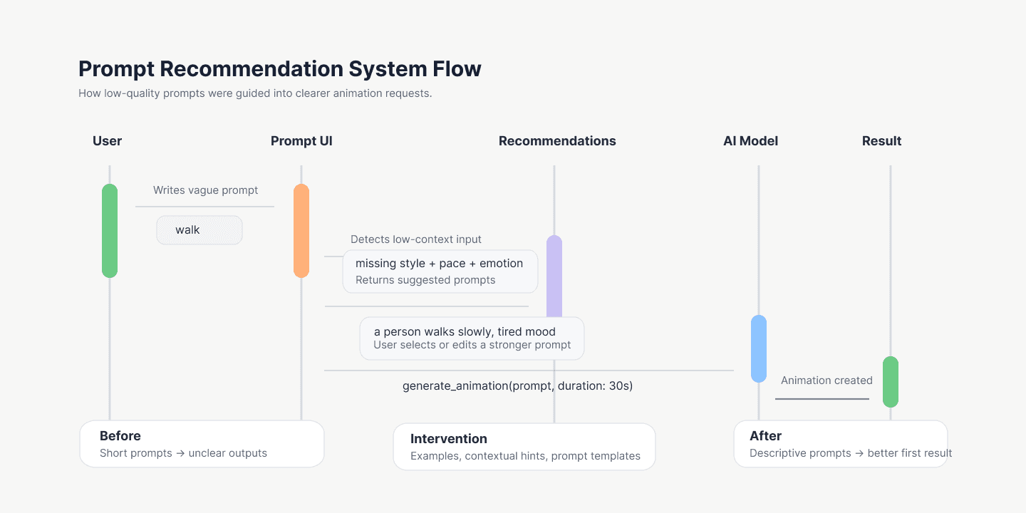
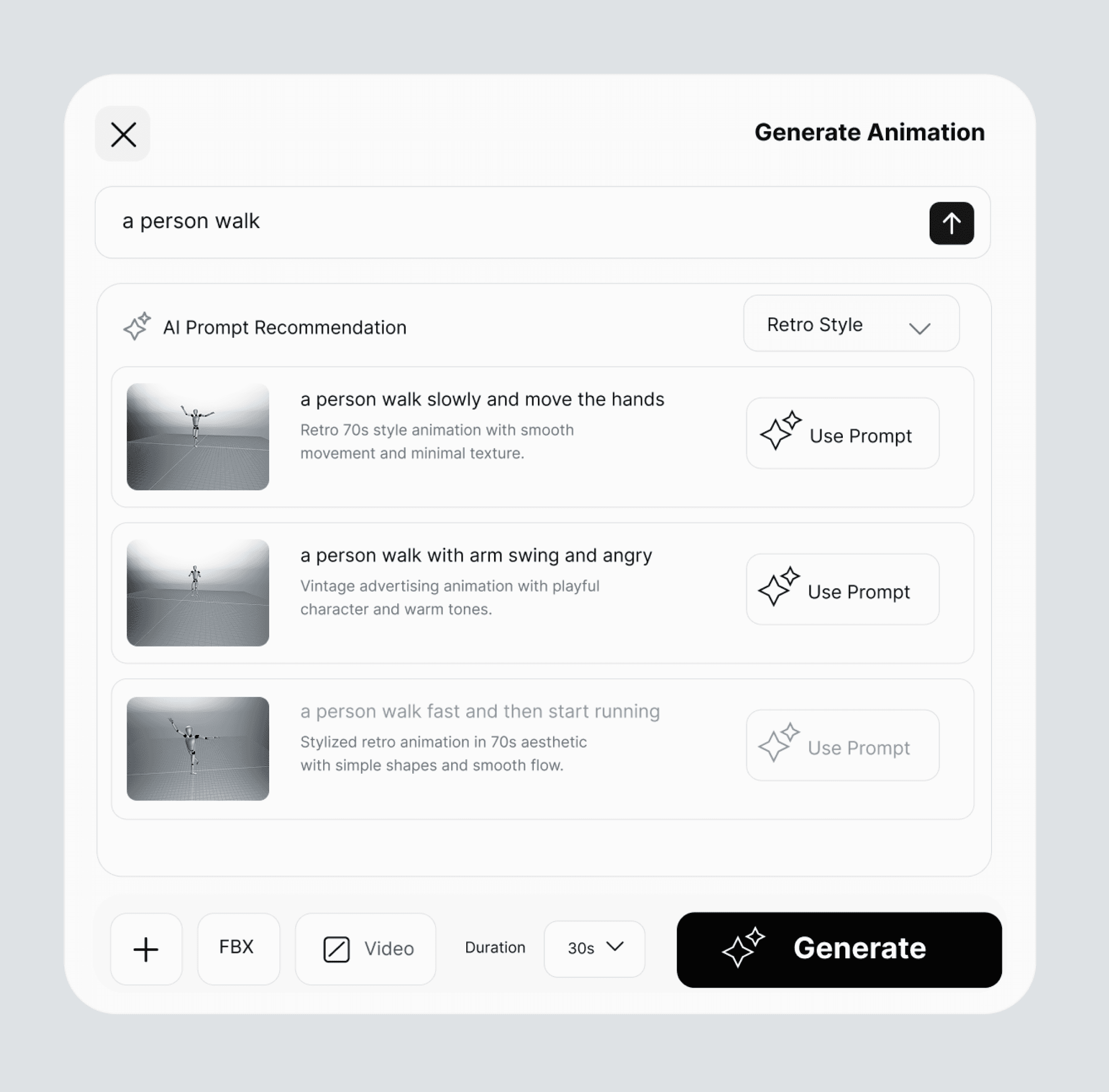
The system now surfaces an AI Prompt Recommendation panel beneath the input field. For a prompt like "a person walk," it suggests fuller alternatives, such as "a person walk slowly and move the hands" ,each with a preview and a style filter, so users can adopt a stronger prompt in one tap. Before a prompt reaches the model, th
e system checks for missing context and offers rewrites the user can accept as-is or edit.
This introduced one new pattern to the design system, the inline recommendation card, while reusing existing filters, buttons, and input styling. I also layered in lightweight prompting challenges and community examples, so writing better prompts became part of using the product, not a separate skill to learn first.
I used AI tools throughout my process too , clustering the 93-prompt sample by intent, stress-testing recommendation copy, and speeding up wireframe iteration, which shaped how I think about designing both for AI products and with AI as a tool.
Beyond the input field itself, we layered in lightweight prompting challenges, short tutorials, and real community examples, so writing better prompts became part of using the product for everyone — not a separate skill new users had to learn before they could get good results.
Resuly
Designing the recommendation system
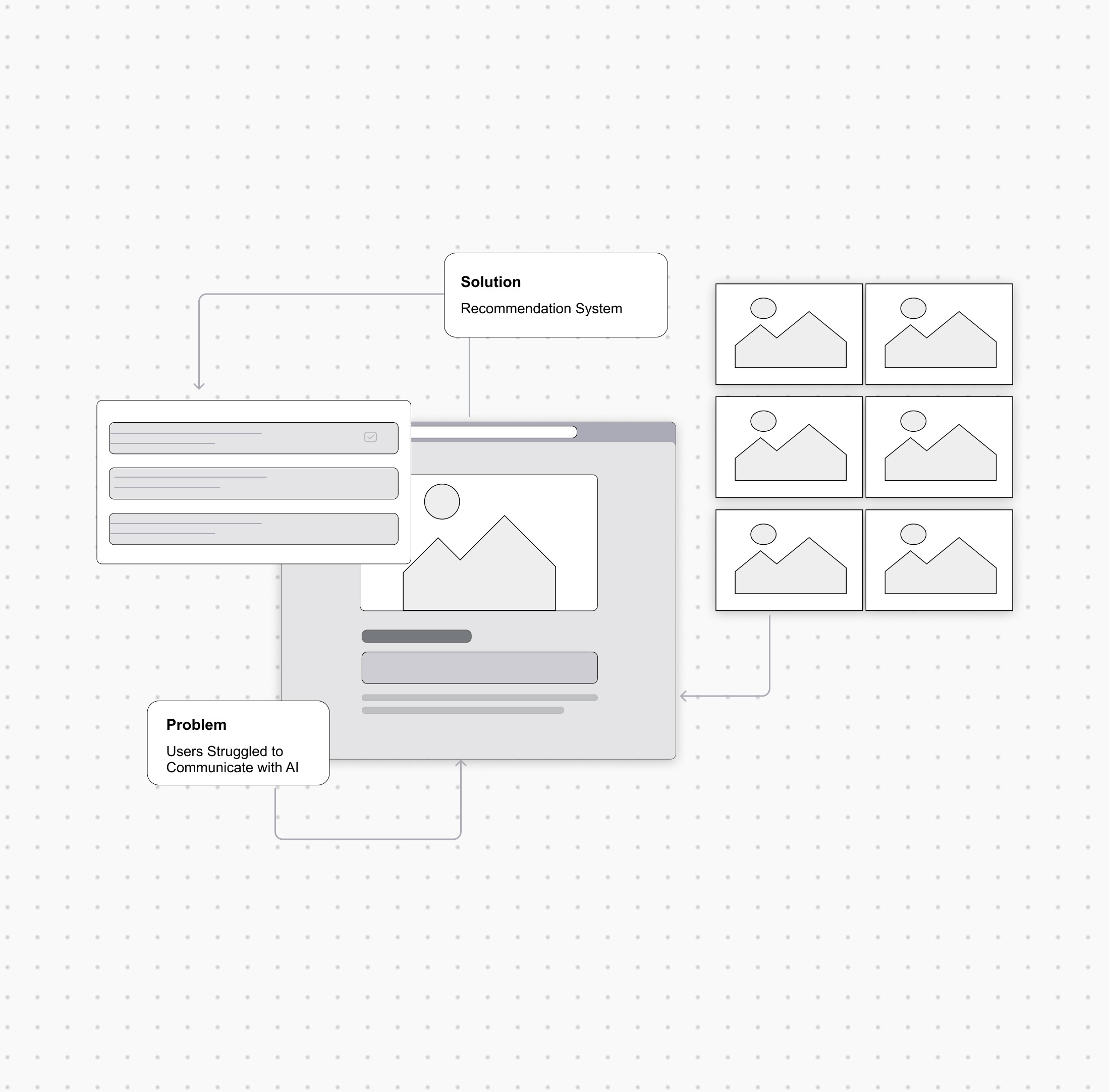
By turning a blank field into a guided, data-informed input, we improved generation quality without touching the model itself. Measured against prompt quality, generation success, and feature adoption:
Stronger prompt quality — prompts across the platform grew more descriptive, with fewer one- and two-word submissions than in the original 93-prompt audit.
Fewer retries — with missing context caught before generation, fewer prompts needed a second or third attempt to produce a usable result.
More exploration — the recommendation panel gave users a low-effort way to explore styles they hadn't typed themselves, instead of relying purely on trial and error.
Platform growth — the product grew to 3.1K active users, and the recommendation logic became the foundation for later onboarding and discovery features.